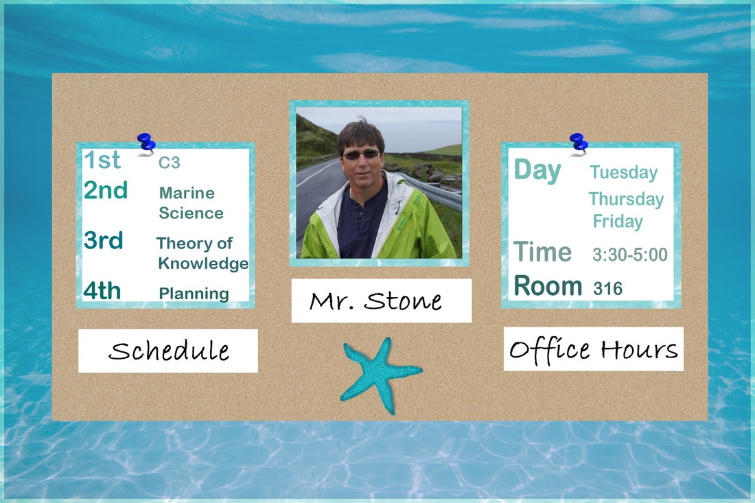
In this exercise, I used image "Before 52". The orginal contained an exorbitant amount of unused white space which created an unbalanced image. To fix this, I created clear margins and added elements to create more balance. I also grouped similar content together and ensured that sufficient white space surrounded each group.
I enlarged and centered the text found at the top in the original and reduced and centered the text found at the bottom of the original. This reduced the amount of holes of white space that didn't serve any purpose. I used an edge alignment for the text and rectangles and used a flush left alignment for the text to make it easier to read and unify the information.
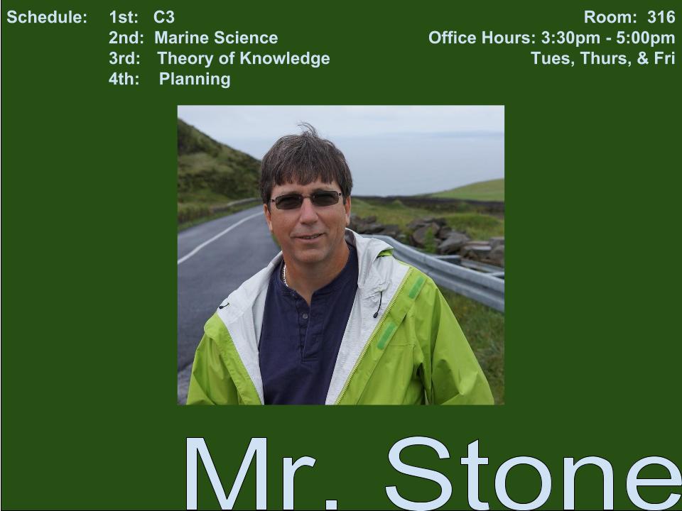
The original image is unbalanced with too much white space, does not comply with alignment principles, and with information in various corners of the image, creates a split attention effect without any symmetry. By creating groups of information and unifying them through the use of alignment and created groups, the image becomes more unified.
Before "52"
After "52"