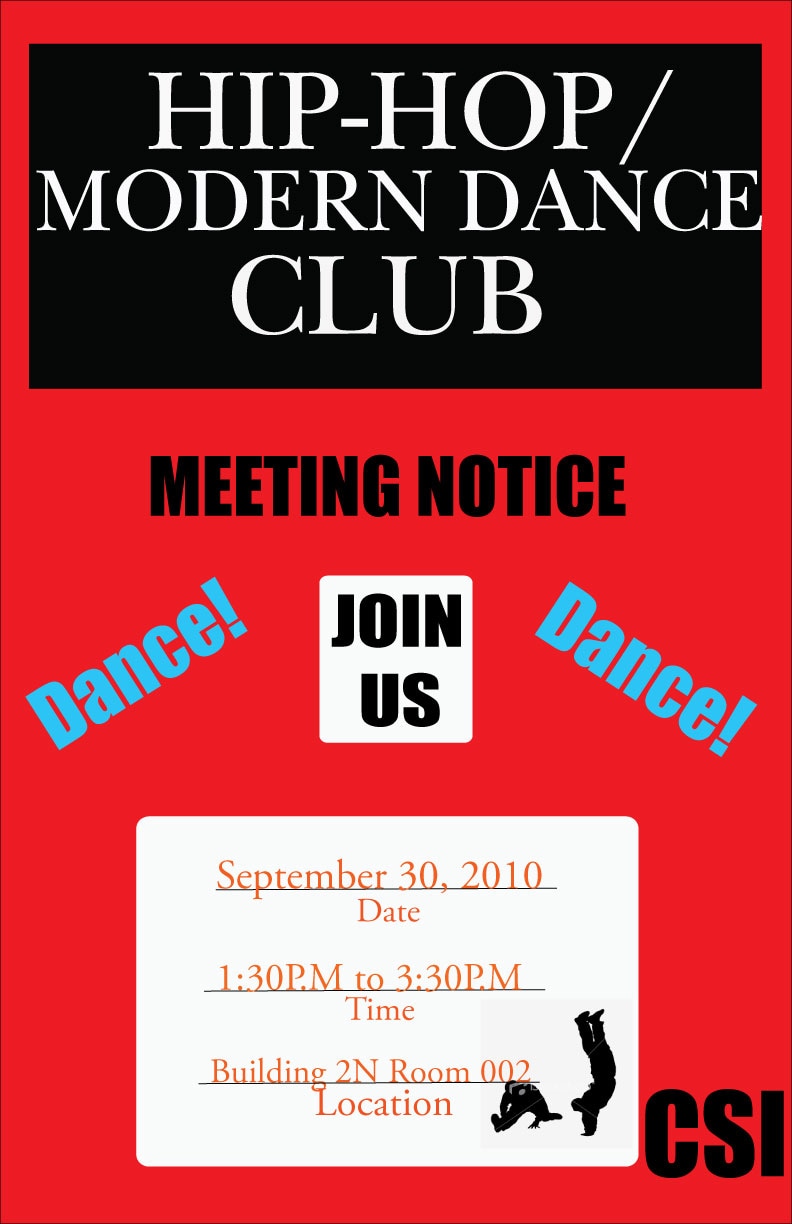
Visual design solutions: Principles and creative inspiration for learning professionals states, "when a design is unified, there is a relationship among the elements and these elements are in agreement, visually or conceptually" (p 170). The before image was anything but unified. The key points were in text boxes, but they were of varying sizes; some of them had rounded edges while others didn't. There was text that wasn't within a text box, which broke up the overall unity of the design, and there didn't seem to be a unified placement or alignment of the elements. Further cluttering the image was the introduction of another color that drew the viewer's attention first to unimportant information.
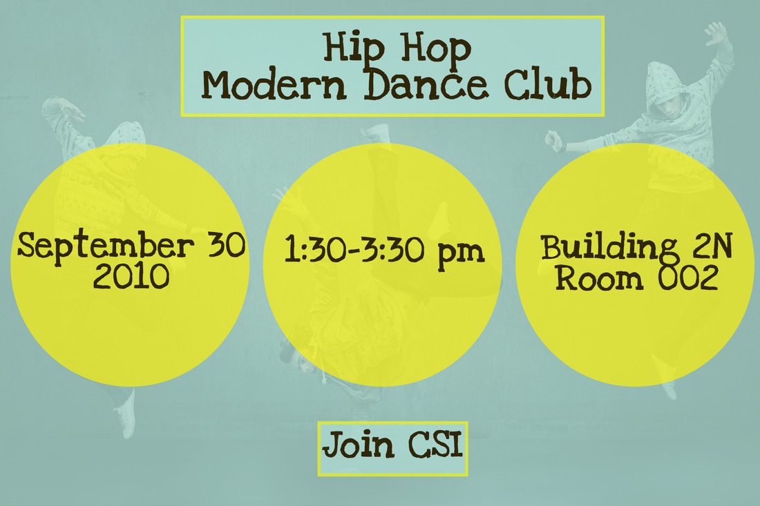
I wanted to create a visual that looked like one item while still separating the key information into three sections. To achieve this, I placed the most important information in three identical circles in a brighter color to attract the viewer's attention. These elements are aligned to show their connection to each other. The repetition of these elements also shows that the information is related.
The title and name of the group are in similar text boxes, one at the top and one at the bottom, both outlined in the color used for the circles. To furthur unify the graphic, I used a background image of three hip hop dancers, one for each of the three key pieces of information. This unifies the image as well as the message.
Before 19
After 19