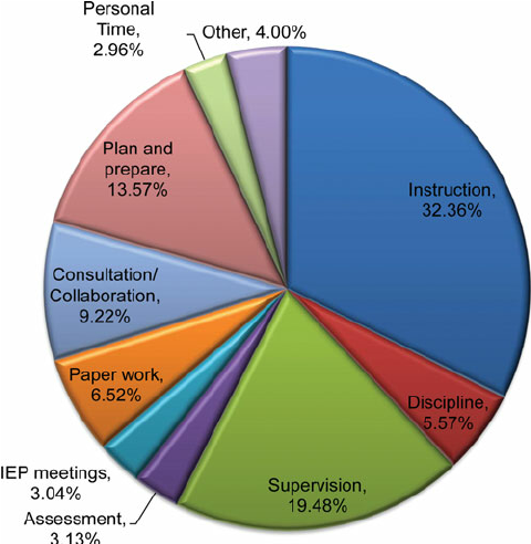
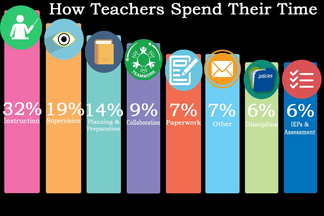
I went out on my own to find a graphic that used numbers and make it more interesting. I found a pie chart discussing what teachers do with their time. I wanted to make the categories stand out more and allow the viewer to truly see how a teacher's time is spent and easily compare the amount of time spent on each. I changed the format to a bar graph, varying the height of the bars to show the difference in the percentage of time spent on each category. I made the background black, with each bar a different color. At the top of each bar, I chose an icon to represent that category, placed the percentage in a larger font within the bar and a smaller label underneath. The numbers are monospaced. I feel the after image allows the reader to clearly visualize the data and see how a teacher's time is spent.
Before
After
| how_teachers_spend_their_time.psd |
