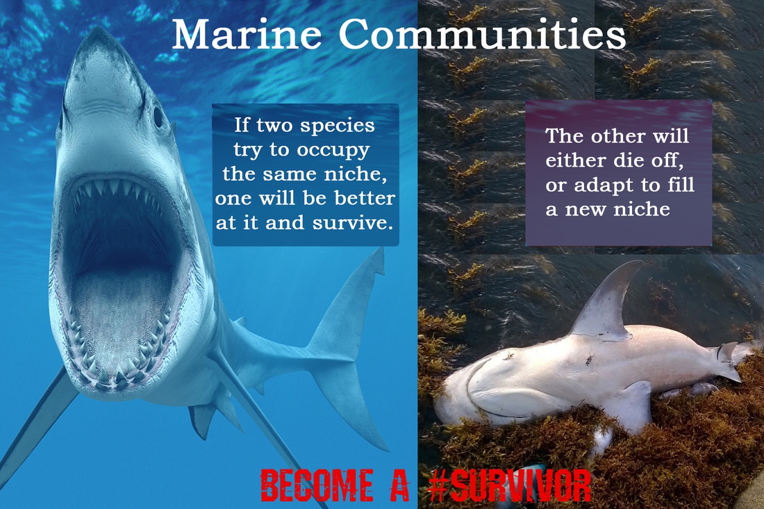
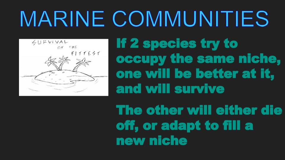
The original graphic used a black and white image with the words, "Survival of the Fittest", which connects to the content of the poster, but the size and coloring of this image make it easy to overlook, making it lose its power as a visual cue to the viewer. The two outcomes of species occupying the same niche are not clearly separated; the viewer cannot immediately glance at the graphic and see the outcomes. To address this and enhance the meaning of the poster, I added background images behind each content point that readers could identify with. A shark with an open mouth would be seen as a sign of power and survival. The image on the right side reinforces the idea that marine life needs to adapt or die. I kept the concept of the survivor, but updated the reference to include a hashtag. The after image is semantically coherent. The enhancements make the graphic consistent and clear; the use of contrasting sides of the image clearly show the two outcomes of two species trying to occupy the same niche.
Before 43
After 43