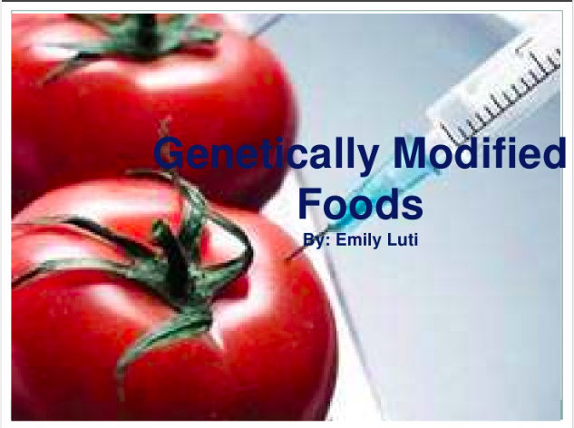
The original file used an image as the background, which was stretched out and pixelated. The image drew attention away from the text, with the focal point being the tomato in the bottom left corner. While the image may be suitable for the topic, it made the overall presentation unbalanced, with the bulk of the weight on the left side. Because the title and the author are on the right side, the viewers attention is drawn away from the pertinent information. The text itself is difficult to read and hanging off the side of the image. The font color blends in with the background image.
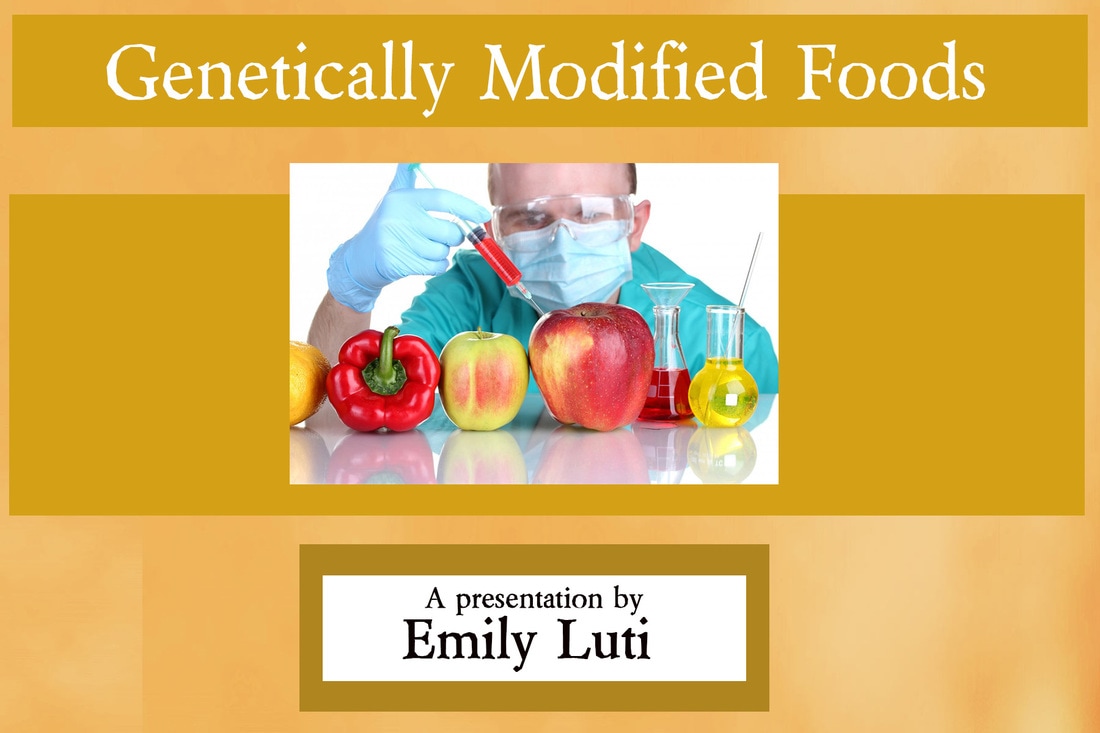
To address these concerns, I changed the background to a textured solid color. I chose a color that compliments a color found in the image I selected to create consistency in the overall appearance. I created white space around the text by using darker colored rectangles and changed the font color to white. I created three horizontal sections using these darker rectangles around the text as well as center retangle running the length of the presentation. I changed the image to one that is much sharper. The new image still places emphasis on the alteration of foods, but I chose an image that includes a person in the hopes of making it feel more personal and less sterile as a way to draw interest and connect with the viewer. I raised the image slightly above center and to create a more 3-dimensional appearance to the image.
Overall, I feel the after version is much cleaner, and the graphic choices make it easier for the audience to read and connect with.
Before "40"
After "40"
| b_a_2.psd |
