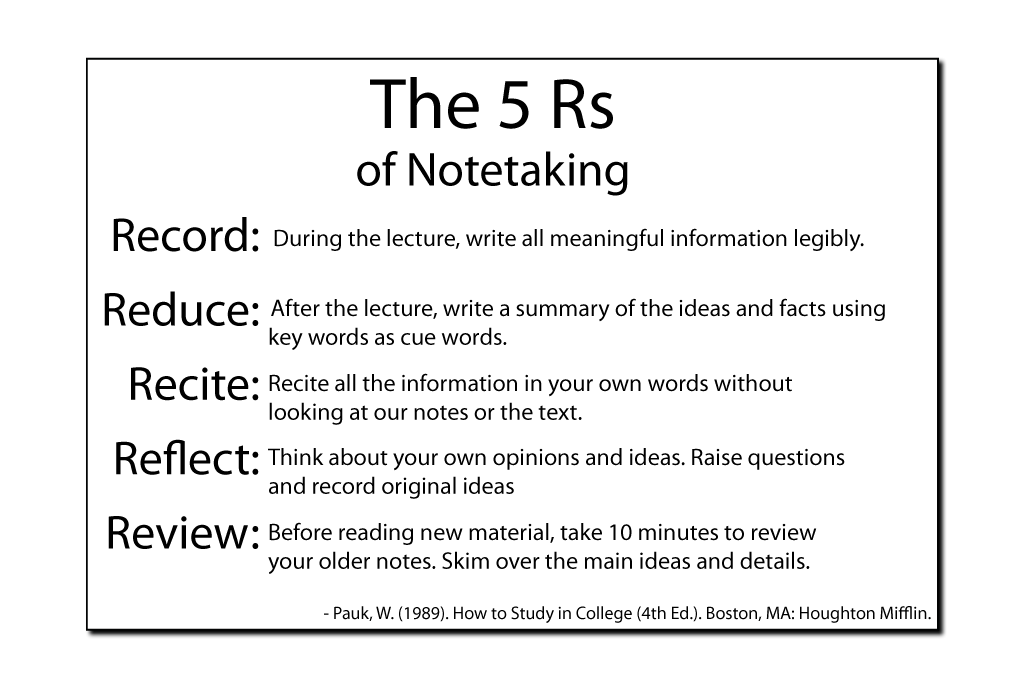
The original "5 R's" was very basic. The typeface is straightforward and uniform throughout the document. It was easy to read in a sans serif font, but there wasn't enough of a distinguishing difference between the display type of the poster and the body text, other than a slight change in font size and weight. There wasn't enough to distinguish key points, so the reader cannot skim and easily takeaway anything from the graphic. There is sufficient contrast between the text and the background color, but since the background color is white with black text, there is nothing distinguishable or present to draw the reader in. All text in the original was aligned left, with one section slightly off alignment.
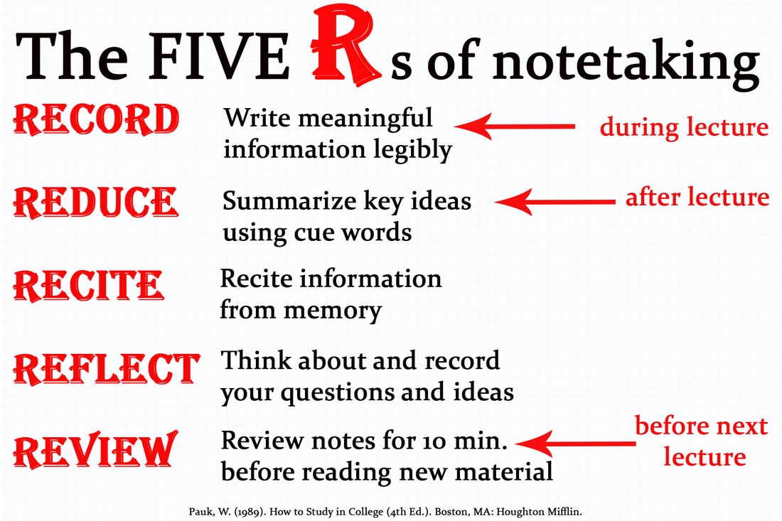
To fix some of these issues, I first used a combination of two serif fonts. The first, Algerian, was used as a decorative font for the display text to draw attention to the key takeaways of the graphic. For the body text, I used Constantia. The display text was 100 pt font while the body text was typed in 60 pt. I used grid paper as a background and added a white rectangle overtop and adjusted the transparency to ensure the background wouldnt interfere with the text clarity. I placed the display text in red. By placing display text in a bright color, the reader can quickly gain key information by scanning the graphic. I aligned the text left for an easier reading experience. I also adjusted the spacing between lines for better leading.
Before "54"
After "54"
| 5_rs.psd |
