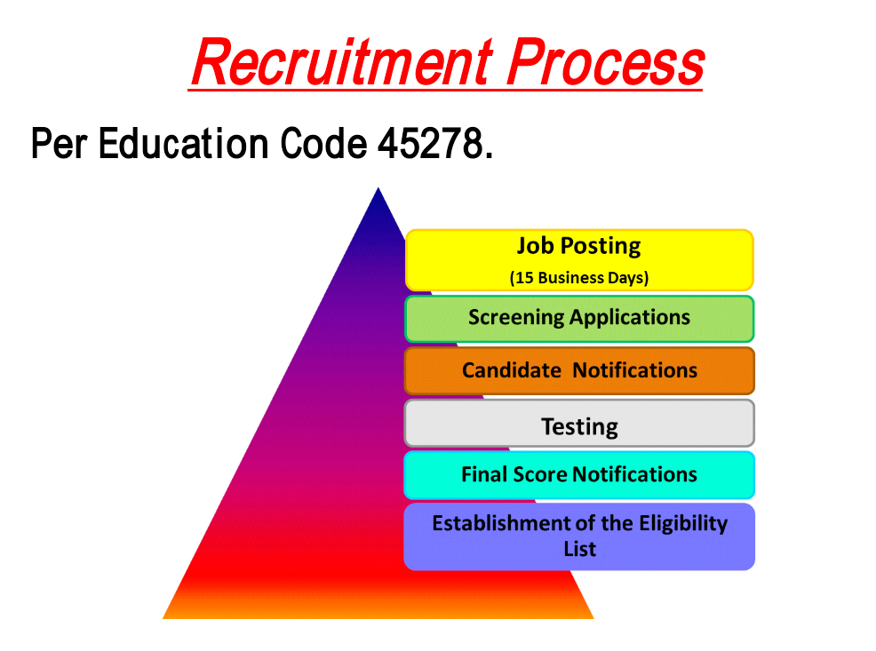
The original graphic discusses the steps of the recuitment process, though the visual hierarchy is a bit confusing. The title is placed on top in a bright color and underlined, but is quickly followed by a piece of information that is better suited as a footnote. The image of a triangle seems to be contradictory to the steps, as the triangle makes you want to look at the bottom even though the steps start at the top. The colors used are not complementary, so it causes extraneous processing. To make a more cohesive design, I first started by using complementary colors throughout.
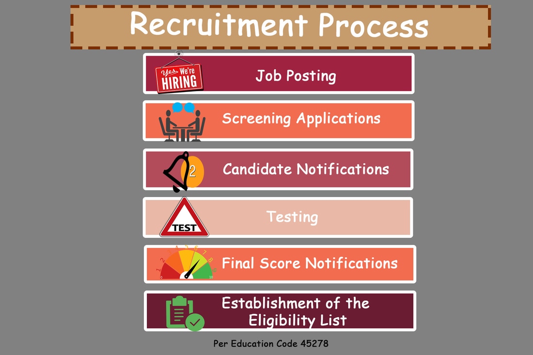
To create a visual hierarchy, I placed the title in the top, with the box extending further to the left since that's the natural progression of western readers. I scaled the title box larger to draw attention to the main idea of the graphic and surrounded it with a dashed line.
I used images to represent each step of the recruiting process since, according to the text, images seem to pull the reader's attention first to accompany short phrases. I used white space to separate the steps and create a visual hierarchy. The overall design appeals to the F-pattern of eye movement.
Before 49
After 49
| after_5.psd |
