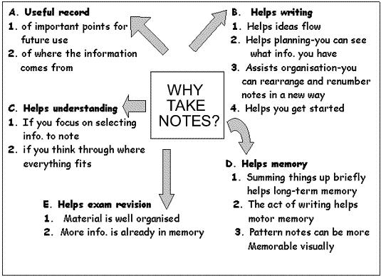
According to our textbook, Visual design solutions: Principles and creative inspiration for learning professionals, visual cues help the reader identify important information. They guide the reader to what's important. The original image did use some visual cues, such as the box in the center and arrows pointing to bolded text. But there were several things that could lead to confusion for the viewer. The arrows weren't uniform and since they are poiting in all directions, the reader doesn't know where to look upon first glance. Since the image was in black and white, there wasn't any piece of text that would immediately grab the reader's attention.
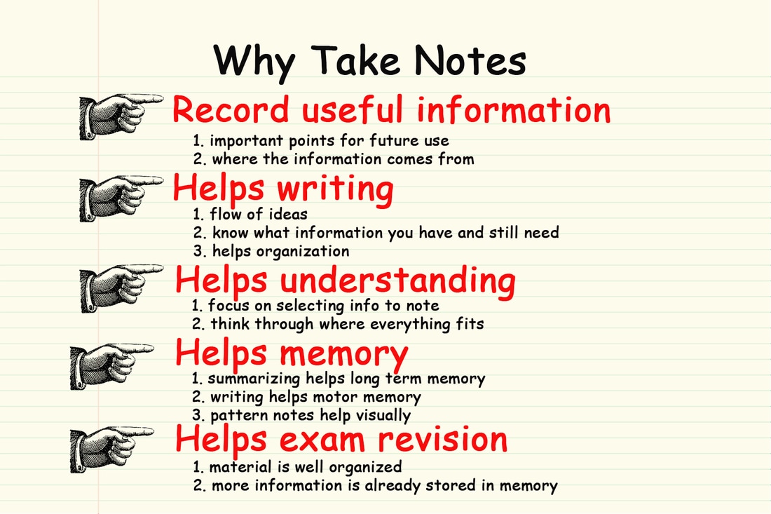
To fix this, I used color and typographical cues to highlight the key information. I also used directional cues to point out the takeaways from the graphic. Since I listed them instead of surrounding the central idea, readers use their natural eye gaze to gather key ideas. The background is a sheet of notebook paper covered by a transparent light yellow rectangle as a way to connect the overall theme of the graphic, which also cues the reader to begin at the top since that's the natural progression when reading a sheet of notebook paper.
Before 58
After 58
| after_6.psd |
